7/14/09

The New Version...


Same dimensions and materials as the first version below...same crappy cell phone...however, this image seems to be better. Well, after posting the original and talking to a couple of you, I decided that I was pretty unhappy with the painting. I feel better about this version. Note: the image of the soccer player in the lower center foreground is a completely new addition...

7/13/09

HIs Shirt. doG _ ribbions


being an artist

so then we work and work and work,
and for me i paint_ i paint_ i paint,
and more recently I have had a couple of shows,
therefore, I have been working extra mad.
so then
what?
comes from this.
you see now i am just in the wondering about it all phases.
i wonder about your experience after shows,
i think i might just lock myself in the closet for three years.
to me i think the best part of any show ___ is making the show,
then
after the show you have to just do nothing.
and now when i see the work i think it might be better of floating down the nearest river.
i am wondering to you.
and to all of you_
what are the up's and down of your work?
do you always love your work?
when are you most close to your work?
how does it feel when you stand in a room full of people looking at your work?
what does it mean if you sell your work?
what does it mean if you do not sell your work?
it order for me to ask these questions , i feel I should give you a little insight to the answers i have come upon.
first of all.
I hate showing my work, and when I am showing it, it is when i hate the work the most.
I love the work the most when it is in my studio.
just me and the work. then when it leaves, I feel I no longer have any connection with it.
sometimes people will say..
"i love your paintings"
and I am like ___ "paintings what paintings?"
as in I almost forget that they are mine hanging upon the walls.
.
anyway ___ is it work?
and why work?
you see too I have been thinking in the last months.
...
about the whole artist thing at all.
i suppose for about 7 years i was so driven by it.....
to make it
to show it
to sell it
and now i am just thinking ,
what the F *#K.
>
artist.
ugh.
could this just be the come down after a show.
I was told last week by some one I really trust,
that one could not be faking "being a painter"
if one loved it so much and lost track of time while doing it.
you see,
i work say 60 hours per week in my studio,
and i must say it might border on an obsession.
then
you
take
your
labor
of
loves
and put them into a public space and then you are left with nothing to work on.
it is like a big wave of water drying up mid-stream.
....
maybe it is like any other job...
and
then
you
nearly
collapse
after
months
and months
of work.
well the last thing i would like to say.
___the last thing I would like to wonder...
is this
do you feel that you have already moved past your "newest" work when it it finished.
in that_
you feel that you will make better and different works__whist you have the newest and freshest works right in front of you?

Just Curious KEllie

7/8/09

New Painting

tim lane


The Attacking Third of the Field, 2009
acrylic, oil paintstick, crayon, cloth, bubble wrap, painters tape, dryer lint on paper
19.5"x22.5"

6/27/09

Monte Do Gozo Mall

Monte De Gozo Mall
4'x4' feet Acrylic, Oil, Tape and QR Codes on canvas stretched over panel.
the landscape in the back is from Monte do Gozo in Spain. It's Galician for like...pleasure mount. it's the last city on the camino before Santiago and back in the day you used to be able to see Santiago from the top of the mountain where there's a little statue you can barely see in the picture. it's kinda center to the right. there is no mall that i know of in monte do gozo...until now.

b

6/26/09

champagne with yax kuk mo

i made this while waiting for paint to dry on a bigger 4'x4' piece. this is 24"x19", acrylic, tape and oil glazes. the pink, text like thing over the forest is tape. the statue is of yax kuk mo who was a mayan king of aztec decent and those rings around his eye are symbols of the storm god. but no storm is coming and everyone is chilling the f out sipping on cristale.
travis and molly good luck with the wedding stuff in michigan!!!
bradneRR

6/23/09

Temporarily


Here's a new 2' square painting, "Temporarily." This was originally going to have a lot more elements -- a couple ghostly icebergs painted floating in the "water" and on the horizon; also a sunken city that I spent quite a bit of time drawing pillars and urns and broken pediments for. Then I attempted to transfer the drawing of the ruins using a piece of paper bag and an oil stick -- total disaster. So I quickly wiped it all off. After a lot of consideration (and some urging from Randi to leave it simple), I decided to stay with this composition. I was trying to juxtapose something like a beautiful sunrise with a gathering storm -- or a tropical sky with arctic waters. The idea that a beautiful sky above reveals nothing about what is sunken and hidden, at least.

6/10/09

white background birds


here are chirp 16 top
and chirp 17 bottom
i keep exporing these birds
so with these two
i was watching dave chappelle...
maybe more importantly i been watching my process
these in particular i decided they were done before i put the big wash of color in the background
what do you think of them in comparison with the previous colored background birds?
the "public" reaction seems to be more in favor of the "finished" look of the others.
im glad i did these

6/9/09

Ian Swanson

There is a Detroit area painter whose work has really been catching my eye lately, Ian Swanson.

www.iancswanson.com

I thought you might enjoy checking his work out -- it's a mix of really highly finished stuff and rougher, almost haphazard elements. I can see a little Chris Martin (the painter, not the guy from Coldplay), a little Aaron Curtner, a little of each of us too, in his work. I thought Tim, especially, might consider him for future SCENE Metrospace stuff.

I'm going to try to make one of his openings, he seems to be pretty active and productive right now, and I totally dig the compositions he comes up with.

6/8/09

some shitty little paintings


i wasn't gonna post these but since there's been no post for awhile...

the top one was a recommendation from my friend dan. i'm sure you guys know how people are constantly telling you "you should paint X" (X usually being the suggester doing something absurd) and you almost always ignore it and think "do you pay any attention to what i actually paint? how would this fit that at all?" but this time around i thought....you know what? even though this idea isn't very close to anything i've been painting lately, i'm going to take up the challenge and paint two monkies sparring on capybara steeds and i'm going to try to fit it into my current "artistic vision" it turned out okay, i think, and it was fun painting the animals.

the shirt one is a funny story that i can't type online but ask me about it sometime. it's called "a few things that happened in my shirt." i don't like this painting but i like the idea of having a bunch of stuff happening in a shirt...in a weird way i think it's similar to stuff travis does when he has a lot of abstraction going on inside a bird or a babe...just here it's repersentational stuff going on. i will hopefully explore this idea more later and hopefully it'll be successful.

these are both 19x24" acrlyic on paper...the capybara one has a QR code in it and the shirt has some aluminum on top.

5/26/09

New small works


I've been moving into a new house this past month and have only stolen a few moments to paint. Here are some pieces I've recently finished.

The top one, "Carthage," was begun a long time ago when I was painting with coffee. I was never that satisfied with it, so I set it aside and recently added the white areas and the small red square. It's framed with leftover strips of black cherry, something I plan to do with a lot of the small pieces.

The second one down is "Reflecting Pool." This one has been through many stages, but finally I'm pretty happy with it. It is a little more vibrant than the colors here suggest.

Finally, "Ascend" is another piece that was begun a long time ago and sort of stagnated as a fairly boring composition until I added the connecting arc and it all kind of activated. The first and last pieces were completed for exhibit in Tim's "Little Big Show" along with 3 others. "Reflecting Pool" is a stand-alone, a color and layering experiment for some of the larger pieces I'm working on.

5/12/09

taking advice and other stuff

with these 19x24 paper pieces i was following some advice from lightgeist. first, kellie's advice from way back when to try doing stuff with no source material and travis' advice when he talked about making paintings that were an identifiable color. here i have green red and purple. next i might do a suggestion of molly's to do a tree house...which i was thinking about back in the day but couldn't make it work. also i was doing new stuff here...using aluminum foil and QR codes. in each QR code there is a few sentences of description of other rooms. so these are about spaces in spaces inside spaces etc. if you have a smart phone you can interact with the paintings, scanning the qr code to get the descriptions. i know these paintings basically suck but i was trying a bunch of new stuff. they really are just studies for later, bigger things. so any feedback is much appreciatd so i can improve the new stuff...especially anything about color...i really wanna get better with the color. also...are the QR codes dumb? thanks!


green room: acrylic, oil, aluminum foil, ink jet print outs

red room: acrylic, aluminum foil, vinyl, tape, ink jet print outs
purple room: acrylic, oil, ink jet print outs


##some of the QR codes say things like:
"I had never seen that door before. How had I missed it? I grew up in that house."

"Deep in the forest there was a florescent pink wall and a purple couch along side it. We sat down and had a drink. "

"We carried the couch into the cave and set the television up. It was damp and dark but we were ok. "

5/11/09

new figures


these are two new watercolors ,
i put birds in their shirts
im now full speed ahead on the book im doing with that writer
after these and getting the first check i can devote more time to it
not feeling like im losing money if im not painting for the gallery
which is something i battle with considering
experimental or outside projects
wierd
these photos are not the best, alot of subtlety is lost
i like these backgrounds. im considering some other forms of abstraction into these large passages
lovin it

5/4/09

oil portrait


Here's the finished piece. I took this crappy first photo in class with my iPhone, so I'll take a better shot and replace it. I'm happy with it overall, but there are a couple of drawing issues that bother me and other minor things I'd like to fix up. I'd be worried to do anything else without reference, though, so it'll probably stay just like this. I learned a lot with this piece, so I'm looking forward to doing another. I've never painted something so small and complex as this face, but there's something fun about painting tiny details.


5/3/09

pro artist hrs

Found this blog entry and thought i'd share it. A professional artist says she spends as much
time in the studio as she did when she was working a 9-5 job. Pretty interesting:

http://joannemattera.blogspot.com/2009/04/marketing-mondays-how-is-your-pie.html

5/2/09

the winding stair

don't think it's done quite yet. that pink has changed a bunch of different colors.
2'x4' acrylic, oil, ink, tape and sequins on canvas over panel.

also here is a link to a better picture of the fountain post below. i think i'm not
gonna add the trees because i like having part of it open. i dunno...

4/26/09

squiqlly fountain: bam-bam


this is a really shitty pic i took in the kitchen cause it'll be awhile before i carry this beast outside. it's 4x4 feet and weighs like 40 pounds probably.
it's acrylic, oil, silver ink and tape on canvas over panel. i attached my source image, too because i wanna know if you think i should add those trees in on the right hand side. i didn't put them in because i wanted an open part to see the landscape. i made this image huge (sorry) so maybe you could see the different textures...especially where i make the bricks...i put down the ink and then sprayed it and then put a shit ton of gel over it and then made little bricks on top of that. the tape is in those ray color things up top. what do you think of that? is there too much goin' on?
cool thanks for any input
b

4/19/09

how do you think about color?

one thing i'm trying to work on lately is color so i was curious how you guys think about it, plan it out and what not (or if you even do...sometimes i don't think about it at all). a real useful site i go to is: http://www.colourlovers.com/
i use a few color arrangements that i find on there in paintings and i try to limit my pallet to
those 5 colors but it rarely works out. i feel like i use way too many colors in one painting. i also made my own swatches of color...which was hard...so then i took some paintings i liked and took 5 colors from them to make swatches to then use in my own paintings. below are a few.

also i discovered is that it's fun to paint a bunch of tape, arrange it, and put a shit ton of medium over it to immortalize it. i'll post the two paintings i'm workin on now that have that soon. gotta wait for some oil to dry and touch up a few things. i've been working much bigger, too.

when i play around with color a lot i feel like i can hear it a little bit. like it harmonizes. especially with those swatches. so i think it's a good excercise to practice "hearing" color. that's the best way i can describe i deal with it...when it "sounds" right rather than "looks" right. kinda hard to explain but the more i practice with it the better i can get at sort of "hearing" it. so i gotta give a big up to nate for that in a way because he told me about ratatat and when i listen to them i feel like i paint better sometimes. i feel like some of the better parts of my paintings sound like ratatat songs. haha. sounds a little dorky and i could be wrong since i'm not the best judge of my own work. do you guys get this feeling, too?

colors from matthias weischer's "egyptian room" (one of my favorite paintings)


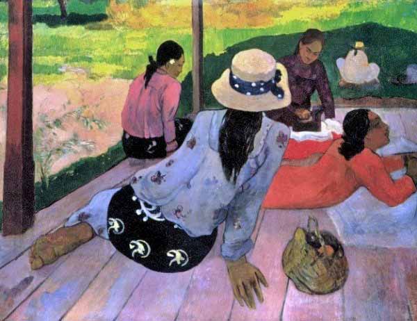
colors from gauguin's "siesta" (a painting i look at at the met a lot...i know he battled with the color on that, changing the girl in the front's dress around a lot)

4/7/09

Framing v. not framing, revisited

[Note: I originally posted this in response to a thread from last September. I assume that few would ever see it. As I gave it some more thought, I thought I'd reopen this can of worms for some further thoughts from anybody out there. As a gallery curator, this was an issue I navigated from both sides. Here is my original comment, slightly edited.]

I'm showing up pretty late to this party, but in regards to framing vs. not framing -- both ways have potential to be a visual distraction. Depends on who you ask and where their aesthetic compass is set to.

Often art (that's not by Vermeer or Rothko or something) lacks psychological "weight" with the potential collecting public. We confront an unfamiliar art object with built in assumptions -- quite different ones than what we confront a Michelangelo or the Mona Lisa with. There is very little we artists can do about this, as non-Vermeers and non-Rothkos. But, one of the very small things we CAN do to distinguish our works and assist them in acquiring psychological weight (other than just painting great paintings) is to give them physicality -- to give them actual, physical mass.

Whether this means framing or not framing is a judgment call on behalf of the artist. I saw a great Raymond Pettibon show where everything was simply pinned up. And I've seen a number of student shows where things are pinned up and/or wrapped in acetate and look like crap.

For most buyers who are "collecting" a piece of art, it's simply not practical to have unframed artwork in their homes, offices, etc. So if they feel compelled to purchase an unframed piece, they're gonna go straight to a frame shop. This, in purely practical terms, adds expense to the piece -- and often quite a bit of expense. A large custom frame can easily cost hundreds -- if not more. One can assume that if they're interested in the piece, they're interested in its longevity.

I read recently (in the book "The Gardner Heist") that there is a single substance on earth which is more valuable per ounce than gold, platinum, diamonds, heroin, you name it -- and it's fine art. Not necessarily MY fine art, but fine art just the same. We're often the worst possible judges of the commodity value of our own work -- we tend to grossly under- or over-value it.

As a consideration to potential buyers, I always put my works on paper into a relatively inexpensive black metal frame with regular window glass over it to protect it. If someone wants to reframe it, fine. I've had to get pretty creative with matting if it's a diptych or an oddly shaped piece. Of course, this adds to my expense and so nudges my prices upward. Back in the day, painters used to hand-carve and gild their own frames. I consider myself lucky.

So in a sense I've capitulated whatever my aesthetic opinion is on having my work ideally be framed/not framed. I've assumed (hoped/prayed/feared) that someone might like it enough to invest in its physical survival -- and I've made that option as attractive to them as my time and financial means allow.

That's my 32 cents.