i use a few color arrangements that i find on there in paintings and i try to limit my pallet to
those 5 colors but it rarely works out. i feel like i use way too many colors in one painting. i also made my own swatches of color...which was hard...so then i took some paintings i liked and took 5 colors from them to make swatches to then use in my own paintings. below are a few.
also i discovered is that it's fun to paint a bunch of tape, arrange it, and put a shit ton of medium over it to immortalize it. i'll post the two paintings i'm workin on now that have that soon. gotta wait for some oil to dry and touch up a few things. i've been working much bigger, too.
when i play around with color a lot i feel like i can hear it a little bit. like it harmonizes. especially with those swatches. so i think it's a good excercise to practice "hearing" color. that's the best way i can describe i deal with it...when it "sounds" right rather than "looks" right. kinda hard to explain but the more i practice with it the better i can get at sort of "hearing" it. so i gotta give a big up to nate for that in a way because he told me about ratatat and when i listen to them i feel like i paint better sometimes. i feel like some of the better parts of my paintings sound like ratatat songs. haha. sounds a little dorky and i could be wrong since i'm not the best judge of my own work. do you guys get this feeling, too?
 colors from matthias weischer's "egyptian room" (one of my favorite paintings)

colors from gauguin's "siesta" (a painting i look at at the met a lot...i know he battled with the color on that, changing the girl in the front's dress around a lot)
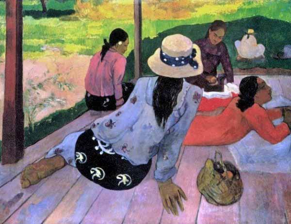
9 comments:
i love this topic
i will be thinking about it
color and sound have been connected by others,
mostly i hear it the other way around
jazz musicians
dont for get
the brown note either
haha
Hahaha....brown note!
I find that I just like certain colors better than others. Since I started painting again, I just sort of ended up with a certain palette.
I ripped out magazine pics of random fashion color schemes that I liked and tried to paint with those color schemes including the models' skin color and hair color. I just couldn't stick with it and ended up with my standard colors or abandoning the piece. It was weird because I really felt a connection to the magazine color scheme, but I couldn't paint with it. I've tried using color schemes from my own outfits too. It didn't really make my paintings change either.
So, now that I think about it, I guess I have a different relationship to color for different mediums.
I did introduce gray, brown, and black into my quilts and I liked that. I was following some fashion color trend of orange and gray that I saw in tennis shoes and high fashion a couple of seasons ago.
I think that maybe it has something to do with the texture of the color for me.
Instead of "hearing" color maybe I physically feel or taste color.
I just don't want to dip my brush into certain colors, but I feel a "yum" when I dip my brush into colors I like and slap it next to another color I like.
I don't really feel a "yum" when I put a quilt together, but I do feel a "heart tug" for individual fabrics that I love.
Hmmm, thanks ner, I never really gave that much thought before.
yes! i hate how i feel such a connection to certain color schemes (sounds weird) and then i just can't use them in a painting! also with clothes...i almost NEVER wear clothes with any of the same colors i use in paintings. my clothes are always brown, grey, navy blue. i never make paintings with those colors....weird. although i guess if i had a lot of money i would buy brighter, more hipster clothes.
one thing i picked up from mark mehaffey is that
one color should be dominant
so as a flexible rule:
i like that red painting
or i like that blue painting
should be the viewers response
another adaptation of that is
i like that warm painting
or i like that cool painting
i use alot of different colors in my work too
i think its because i get a little bored, but i try to color dominate
and add accents of outside colors
to make it more exciting for me
when picking a palette in watercolor, for instance my redeem series
i tried to pick 3 colors that were dynamically opposed,
scarlette
and green
then a blue that leaned to the green
and a blue that leaned to the red
(prussian blue red and green shade)
(look very similar but mix a little better)
one of the keys for me was that each of these colors could go very deep to very light
and have a full saturation range
IE, i didnt use paynes gray instead of prussian blue
if i added a color it was in highlights like olive green
or i drew with a super saturated crayon (like violet) first then painted my color scheme over it
so the piece tied together still
because the color was integrated
Jim ferguson used to say
you can use any color as long as you mix it in to the other colors somewhere else
and i found that i was creating a new composition with color with the placement
of course you must allow for the muse to direct as well, so i dont plan everything
but i usually problem solve with that idea after i get started and the painting is just wrong for some reason
ed paschke said he painted everything in black and white then added color so he didnt have to worry about it
he would then be balancing transparent and translucent to o-pay-ach areas (how do you spell that) haha
i use whatever colors turn me on.
Tim, your always on
Judith Rothschild painted based on a 12-tone musical scale that she had arranged into colors.
I keep trying to mute and limit my palette to black, white, ochres and browns. But the bright colors keep coming back!
"opaque"
I love reducing paintings to just their colors. It was one of my favorite assignments in Color & Design.
I have a few favorite colors that I work with a lot, and some "secret weapon" colors that just demand the viewer's eyes and don't let go. I also have a mix, I call it "Superman Ice Cream," it's mostly red and yellow with a little blue mixed in, makes a nice rich earthy deep terra cotta color.
I feel like I have a color sense but I haven't been good about thinking of it in analytical terms. Often I just throw down some violet oxide and follow my intuition. I think I generally work with a yellow-orange range vs. a blue-green range, with earthtones, white, and black used to keep it from being too floaty.
Post a Comment