 from my recent little paintings
4/30/09

4/26/09
squiqlly fountain: bam-bam


this is a really shitty pic i took in the kitchen cause it'll be awhile before i carry this beast outside. it's 4x4 feet and weighs like 40 pounds probably.
it's acrylic, oil, silver ink and tape on canvas over panel. i attached my source image, too because i wanna know if you think i should add those trees in on the right hand side. i didn't put them in because i wanted an open part to see the landscape. i made this image huge (sorry) so maybe you could see the different textures...especially where i make the bricks...i put down the ink and then sprayed it and then put a shit ton of gel over it and then made little bricks on top of that. the tape is in those ray color things up top. what do you think of that? is there too much goin' on?
cool thanks for any input
b
4/19/09
how do you think about color?
one thing i'm trying to work on lately is color so i was curious how you guys think about it, plan it out and what not (or if you even do...sometimes i don't think about it at all). a real useful site i go to is: http://www.colourlovers.com/
i use a few color arrangements that i find on there in paintings and i try to limit my pallet to
those 5 colors but it rarely works out. i feel like i use way too many colors in one painting. i also made my own swatches of color...which was hard...so then i took some paintings i liked and took 5 colors from them to make swatches to then use in my own paintings. below are a few.
also i discovered is that it's fun to paint a bunch of tape, arrange it, and put a shit ton of medium over it to immortalize it. i'll post the two paintings i'm workin on now that have that soon. gotta wait for some oil to dry and touch up a few things. i've been working much bigger, too.
when i play around with color a lot i feel like i can hear it a little bit. like it harmonizes. especially with those swatches. so i think it's a good excercise to practice "hearing" color. that's the best way i can describe i deal with it...when it "sounds" right rather than "looks" right. kinda hard to explain but the more i practice with it the better i can get at sort of "hearing" it. so i gotta give a big up to nate for that in a way because he told me about ratatat and when i listen to them i feel like i paint better sometimes. i feel like some of the better parts of my paintings sound like ratatat songs. haha. sounds a little dorky and i could be wrong since i'm not the best judge of my own work. do you guys get this feeling, too?
 colors from matthias weischer's "egyptian room" (one of my favorite paintings)

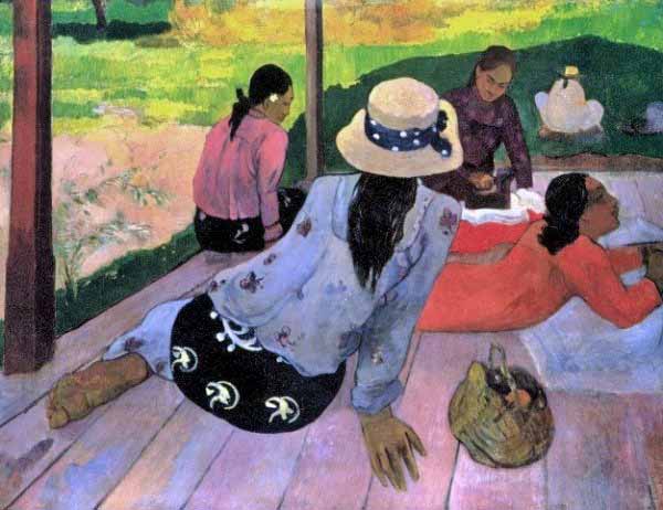
colors from gauguin's "siesta" (a painting i look at at the met a lot...i know he battled with the color on that, changing the girl in the front's dress around a lot)
i use a few color arrangements that i find on there in paintings and i try to limit my pallet to
those 5 colors but it rarely works out. i feel like i use way too many colors in one painting. i also made my own swatches of color...which was hard...so then i took some paintings i liked and took 5 colors from them to make swatches to then use in my own paintings. below are a few.
also i discovered is that it's fun to paint a bunch of tape, arrange it, and put a shit ton of medium over it to immortalize it. i'll post the two paintings i'm workin on now that have that soon. gotta wait for some oil to dry and touch up a few things. i've been working much bigger, too.
when i play around with color a lot i feel like i can hear it a little bit. like it harmonizes. especially with those swatches. so i think it's a good excercise to practice "hearing" color. that's the best way i can describe i deal with it...when it "sounds" right rather than "looks" right. kinda hard to explain but the more i practice with it the better i can get at sort of "hearing" it. so i gotta give a big up to nate for that in a way because he told me about ratatat and when i listen to them i feel like i paint better sometimes. i feel like some of the better parts of my paintings sound like ratatat songs. haha. sounds a little dorky and i could be wrong since i'm not the best judge of my own work. do you guys get this feeling, too?
 colors from matthias weischer's "egyptian room" (one of my favorite paintings)
colors from gauguin's "siesta" (a painting i look at at the met a lot...i know he battled with the color on that, changing the girl in the front's dress around a lot)
4/7/09
Framing v. not framing, revisited
[Note: I originally posted this in response to a thread from last September. I assume that few would ever see it. As I gave it some more thought, I thought I'd reopen this can of worms for some further thoughts from anybody out there. As a gallery curator, this was an issue I navigated from both sides. Here is my original comment, slightly edited.]
I'm showing up pretty late to this party, but in regards to framing vs. not framing -- both ways have potential to be a visual distraction. Depends on who you ask and where their aesthetic compass is set to.
Often art (that's not by Vermeer or Rothko or something) lacks psychological "weight" with the potential collecting public. We confront an unfamiliar art object with built in assumptions -- quite different ones than what we confront a Michelangelo or the Mona Lisa with. There is very little we artists can do about this, as non-Vermeers and non-Rothkos. But, one of the very small things we CAN do to distinguish our works and assist them in acquiring psychological weight (other than just painting great paintings) is to give them physicality -- to give them actual, physical mass.
Whether this means framing or not framing is a judgment call on behalf of the artist. I saw a great Raymond Pettibon show where everything was simply pinned up. And I've seen a number of student shows where things are pinned up and/or wrapped in acetate and look like crap.
For most buyers who are "collecting" a piece of art, it's simply not practical to have unframed artwork in their homes, offices, etc. So if they feel compelled to purchase an unframed piece, they're gonna go straight to a frame shop. This, in purely practical terms, adds expense to the piece -- and often quite a bit of expense. A large custom frame can easily cost hundreds -- if not more. One can assume that if they're interested in the piece, they're interested in its longevity.
I read recently (in the book "The Gardner Heist") that there is a single substance on earth which is more valuable per ounce than gold, platinum, diamonds, heroin, you name it -- and it's fine art. Not necessarily MY fine art, but fine art just the same. We're often the worst possible judges of the commodity value of our own work -- we tend to grossly under- or over-value it.
As a consideration to potential buyers, I always put my works on paper into a relatively inexpensive black metal frame with regular window glass over it to protect it. If someone wants to reframe it, fine. I've had to get pretty creative with matting if it's a diptych or an oddly shaped piece. Of course, this adds to my expense and so nudges my prices upward. Back in the day, painters used to hand-carve and gild their own frames. I consider myself lucky.
So in a sense I've capitulated whatever my aesthetic opinion is on having my work ideally be framed/not framed. I've assumed (hoped/prayed/feared) that someone might like it enough to invest in its physical survival -- and I've made that option as attractive to them as my time and financial means allow.
That's my 32 cents.
I'm showing up pretty late to this party, but in regards to framing vs. not framing -- both ways have potential to be a visual distraction. Depends on who you ask and where their aesthetic compass is set to.
Often art (that's not by Vermeer or Rothko or something) lacks psychological "weight" with the potential collecting public. We confront an unfamiliar art object with built in assumptions -- quite different ones than what we confront a Michelangelo or the Mona Lisa with. There is very little we artists can do about this, as non-Vermeers and non-Rothkos. But, one of the very small things we CAN do to distinguish our works and assist them in acquiring psychological weight (other than just painting great paintings) is to give them physicality -- to give them actual, physical mass.
Whether this means framing or not framing is a judgment call on behalf of the artist. I saw a great Raymond Pettibon show where everything was simply pinned up. And I've seen a number of student shows where things are pinned up and/or wrapped in acetate and look like crap.
For most buyers who are "collecting" a piece of art, it's simply not practical to have unframed artwork in their homes, offices, etc. So if they feel compelled to purchase an unframed piece, they're gonna go straight to a frame shop. This, in purely practical terms, adds expense to the piece -- and often quite a bit of expense. A large custom frame can easily cost hundreds -- if not more. One can assume that if they're interested in the piece, they're interested in its longevity.
I read recently (in the book "The Gardner Heist") that there is a single substance on earth which is more valuable per ounce than gold, platinum, diamonds, heroin, you name it -- and it's fine art. Not necessarily MY fine art, but fine art just the same. We're often the worst possible judges of the commodity value of our own work -- we tend to grossly under- or over-value it.
As a consideration to potential buyers, I always put my works on paper into a relatively inexpensive black metal frame with regular window glass over it to protect it. If someone wants to reframe it, fine. I've had to get pretty creative with matting if it's a diptych or an oddly shaped piece. Of course, this adds to my expense and so nudges my prices upward. Back in the day, painters used to hand-carve and gild their own frames. I consider myself lucky.
So in a sense I've capitulated whatever my aesthetic opinion is on having my work ideally be framed/not framed. I've assumed (hoped/prayed/feared) that someone might like it enough to invest in its physical survival -- and I've made that option as attractive to them as my time and financial means allow.
That's my 32 cents.
3/30/09
been way too long...

"Lambent Terminal," 2'x2'. I finished this one this morning.

"Navigators," 2'x2'.

"Meridians," 2'x2', my friend Justin commissioned this to give to his best friends for their wedding.
I finally figured out a way around a problem I've been having with my camera, so here are some paintings from late fall/winter 2008 and, well, today. The top two are very textury -- I started them out by gessoing two boards and then squishing them together and letting the gesso dry. The bottom piece is on canvas. Forgive the slight fuzziness of the photos!
- Peter
3/22/09
looked good

i liked this, as i was scanning my images in, the background white was being confused and not scanning the whole of my images.... i had to put something color in the background to get my image to come out.
3/20/09


5" x 7"s

these are the 5" x 7" mini paintings i've been doing for the past month or so and i think i'm going to stop now. there're 32 in all. acrylic, oil, graphite, stickers and ink. it's funny...i got some flourecent golden paint and it totally doesn't show up on the scanner. turns to weird gray. biggest example is the cube on the bottom.
3/19/09
The Big Stage

The Big Stage, 2009
acrylic and dryer lint on board
24"x24"
tim lane
inlovewithplaid@comcast.net
3/6/09
some info
yo i just was reading this blog written by an art dealer in nyc and he's a real good writer and has a lot of very useful info so i just thought i'd share it:
http://edwardwinkleman.blogspot.com/2009/02/advice-for-artists-seeking-gallery.html
there are a lot of good links and shit too. also he recommended this book comin out in a few
weeks:
http://www.facebook.com/pages/ARTWORK-Everything-You-Need-to-Know-and-Do-As-You-Pursue-Your-Art-Career/61944093096
it's really hard to find honest useful info about art on the internet. soooo much of the info
is directed for different kinds of artists...like non contemporary i guess...and vanity galleries
trying to screw people over. it took me a lot of trolling around to find this stuff...
b
http://edwardwinkleman.blogspot.com/2009/02/advice-for-artists-seeking-gallery.html
there are a lot of good links and shit too. also he recommended this book comin out in a few
weeks:
http://www.facebook.com/pages/ARTWORK-Everything-You-Need-to-Know-and-Do-As-You-Pursue-Your-Art-Career/61944093096
it's really hard to find honest useful info about art on the internet. soooo much of the info
is directed for different kinds of artists...like non contemporary i guess...and vanity galleries
trying to screw people over. it took me a lot of trolling around to find this stuff...
b
3/4/09


2/25/09
need your help
yo guys,
i'm gettin ready to ship some stuff for april and i have 7 of these 4 feet long paintings.
i want to leave one at home and i can't decide which one is the worst. i narrowed it down to
three. so out of these three links...which one do you think i should leave at home?
thanks for any input...
http://secretmuseum.matterwave.net/PAINTINGS/spaceroom.jpg
http://secretmuseum.matterwave.net/PAINTINGS/homestudio.jpg
http://secretmuseum.matterwave.net/PAINTINGS/pinkpyramid.jpg
i'm gettin ready to ship some stuff for april and i have 7 of these 4 feet long paintings.
i want to leave one at home and i can't decide which one is the worst. i narrowed it down to
three. so out of these three links...which one do you think i should leave at home?
thanks for any input...
http://secretmuseum.matterwave.net/PAINTINGS/spaceroom.jpg
http://secretmuseum.matterwave.net/PAINTINGS/homestudio.jpg
http://secretmuseum.matterwave.net/PAINTINGS/pinkpyramid.jpg
2/13/09
new stuff
the first painting i have two pictures of.. just thought it might be interesting. what do you think of the changes? the top one is the first draft...(shitty pic) and the bottom one is more final. (4 feet by 2 feet)
middle pic is of spain on paper (19"x24") mostly acrylic. shadows are oil glazes.
last one is acrylic and oil 4 feet by 2 feet. i was putting some paint in a little squeeze tube and squeezing it out on the floor of the room. the tv screen image is what i remember of some vuillard painting of WWI that i loved. thought i could steal it since our last names are so similar.
so travis and molly these are prolly the last before the show. so be brutally honest since we're selling them together as friends.


middle pic is of spain on paper (19"x24") mostly acrylic. shadows are oil glazes.
last one is acrylic and oil 4 feet by 2 feet. i was putting some paint in a little squeeze tube and squeezing it out on the floor of the room. the tv screen image is what i remember of some vuillard painting of WWI that i loved. thought i could steal it since our last names are so similar.
so travis and molly these are prolly the last before the show. so be brutally honest since we're selling them together as friends.


2/11/09

2/4/09
more new work
 new piece
not unlike my others ,
still making women/package/explosions
this time i put a little person insider her heart area
cheering
the banner says "between"
1/27/09
the big i #2

so, i'm working on this little guy. i'm going to redo the whole right side. i'm happy with how the left side looks and i think i'm going to simplify color and pattern on the right square. i think i'll make the right side bottom green stripes match the left side bottom. i think i'll make that green and black and white highway on the right only one or two fabrics, and brown or just green. i think i will change the dark highway into oranges similar to the left side. then i will change the blackground on the right to match the background on the left. obviously i was going for a peaceful side and a more complex side, but i got a little too carried away. i'm not totally sure what to do with the three stripes in the divide. in the picture they were part of one tower and i want them to look close to the viewer. things will line up more in the finished piece, my picture is a little messed up. the top lines of the ground will line up and the orange stripe in the background of the righ side will line up with the orange highway from the left. let me know if you have any ideas.

1/17/09
bird book

im working on a new project,
11 paintings for a book an e-friend wrote
birds are the characters in the book
heres the first good drawing
i might switch from gals to birds for the next few months
on my personal work too
a challenging thing to draw for sure
1/12/09
Tim Lane: New Work

Girl Power, 2009
acrylic, gouache, pencil, collage, dryer lint, tacks, ponytail holder, socks
on canvas
40"x30"

Happy Couple, 2009
acrylic, oil paintstick, gouache, crayon, collage, fabric, dryer lint, nail, socks
on plywood
24"x24"
1/10/09
two new interiors
 Miami Room 18"x30" acrylic (with a wiiii little bit of oil on the shadows) on canvas
 vestibule two (soccer ball) 26"x34" acrlic, embossing powder and oil on canvas
these paintings are most likely for the show in april. i'm pretty sure they're done. i've been making little teeny changes for the past month. what do you think of the embossing powder in the vestibule two? it's mostly on the stairwell...nate i took your advice about the back room and put an inside edge on the doorway for depth...
Miami Room is taken from a little tiny two inch tall photograph of an apartment for sale in Miami. i really liked how the light came through the curtain thing and made all kinds of crazy lines. it's probably my least weird painting. i was trying to be more mature or something. i don't know...i used a trashbag full of tape to do that painting. it's almost entirely done with a knife and tape...just a little bit of brush work with the furniture.
1/6/09
fancy flags


ok...i really need some help/advice with these. i went to michael's over break and got a bunch of beads and sequins and shit and also some embossing powder which i put in the acrylic and blast with heat. i put the beads in gel medium...i saw a raqib shaw show at the met (nate you gotta see it) and it blew me away and i wanna try to do some things he does...
but basically these are studies with the beads and embossing and acrylic paint.
do they suck? i can't completely tell. annie doesn't like them so much. should i use the beads as
just accent or do you like them all over? what about the embossing stuff? should i put stuff in the background or do you like the matte color? do these look too craftyish?
my plan is to make big 4 feet long cities (2 feet high) that are done in this style. with little teeny details and sequins and embossing stuff. kind of abstract/cartoony a bit...from my mind and not from pictures. it will cost a lot in beads and other materials and take a loooong time. (these flags
take about 8 hours each) so i might do one slightly bigger study before i invest myself in that.
i have some other paintings i'll post soon...waiting for a good picture day. these were scanned in and are 8x8 inches.
thanks for any critique
b
12/31/08
from tim

I finished this painting some time in late October/early November, I really can't remember. I can't remember it's title. Mainly acrylic, I think. 30"x17" on paper. Not a great photo, poor lighting, but had to make do. This painting is important to me because it's the first time I've been able to really nail a good image of my daughter.
12/22/08
julia fernandez-pol
http://www.sandycarsongallery.com/artists/fernandezpol/fernandezpol.html
i just found these paintings. i love them. i think i will try some of her techniques.
if ya'll ever come across some hip quilts let me know.
i just found these paintings. i love them. i think i will try some of her techniques.
if ya'll ever come across some hip quilts let me know.
12/21/08
success
http://entertainment.timesonline.co.uk/tol/arts_and_entertainment/books/article4969415.ece
thought yall might find this guys ideas helpful and inspiring,
he asserts, 10,000 hours in a craft makes a master.
my dad would agree, he not only said practice makes perfect but would qualify "perfect practice makes perfect"
thought yall might find this guys ideas helpful and inspiring,
he asserts, 10,000 hours in a craft makes a master.
my dad would agree, he not only said practice makes perfect but would qualify "perfect practice makes perfect"
12/19/08
quilt pics

these are the pics for the next two quilts i'm working on. i've done the drawing stage and have had them copied on big paper. i just need to copy it onto the freezer paper and then i can start ironing the pattern to the fabric and sew. i have gone fabric shopping...

crafting out

i did a craft fair with my friend this christmas season. that head is a styrofoam head that i decoupaged with anime. she is lovely in person.

crafting out

i made these gloves for myself out of this hand dyed and hand spun yarn that i have been hoarding away. it needed to be used and loved. new favorite colour scheme, orange and gray.


12/17/08
Shark

Here's a painting I worked on in class for several weeks--2-3 hours at a time. It took me a long time to get it going. It looked like an underpainting for about 5 weeks. Then something clicked and I finished it in 3 sessions. It still needs some work, but I'm going to let it dry first. Sorry for the shitty photo. It's 24x13, oil on panel.
12/9/08
work habits
me and travis were talking and thought it might be interesting to have a post where we talk about our work habits...how we manage our time, what we do with our time. so i'll start it off:
on a day of work if i get home at 4 i try to paint 3 hours that day and any later 2 hours. i'm tired as hell when i get home so i always first brew a cup of tea and that pumps me up. on the weekends i usually paint 7-8 hours a day but some days i go to the city to do whatever...but on those days i try to stop by the art store in chinatown.
in the summer i go crazy and paint usually 7-8 hours every single day but then usually one day i'll end up havin to do something and i'll paint like 2 hours. i barely ride the train or leave my neighborhood...it's so great.
after a day of painting all day it feels good to go for a run or play video games.
while i paint i usually have a movie on or a tv show or an audio book or some music. when i am in the decision making process of a painting, like the pre sketches or whatever i need silence. but as you know my stuff has a lot of tedious shit in it and to get through that it really helps to have something entertaining on in the background. right now i'm going through the show Mad Men and it's sweet.
I don't usually write out ideas like travis does although i really think i might now that i'm playing around more with paint. i usually do a lot of pre drawing in my sketch book and then i put like 10 layers of wet acrylic down (using a hairdryer to dry each layer) and then draw a little bit and then i start tapping parts off and getting the layers on. i usually just think up techniques based on what the painting needs at that moment and then just roll with it. but i'd like to have it more planned out in the future...
so that's it.
a day where i don't paint or do something creative or related to painting i feel like it's wasted and i get even a little depressed or angry...
tell me what you guys do
i'm real curious
b
on a day of work if i get home at 4 i try to paint 3 hours that day and any later 2 hours. i'm tired as hell when i get home so i always first brew a cup of tea and that pumps me up. on the weekends i usually paint 7-8 hours a day but some days i go to the city to do whatever...but on those days i try to stop by the art store in chinatown.
in the summer i go crazy and paint usually 7-8 hours every single day but then usually one day i'll end up havin to do something and i'll paint like 2 hours. i barely ride the train or leave my neighborhood...it's so great.
after a day of painting all day it feels good to go for a run or play video games.
while i paint i usually have a movie on or a tv show or an audio book or some music. when i am in the decision making process of a painting, like the pre sketches or whatever i need silence. but as you know my stuff has a lot of tedious shit in it and to get through that it really helps to have something entertaining on in the background. right now i'm going through the show Mad Men and it's sweet.
I don't usually write out ideas like travis does although i really think i might now that i'm playing around more with paint. i usually do a lot of pre drawing in my sketch book and then i put like 10 layers of wet acrylic down (using a hairdryer to dry each layer) and then draw a little bit and then i start tapping parts off and getting the layers on. i usually just think up techniques based on what the painting needs at that moment and then just roll with it. but i'd like to have it more planned out in the future...
so that's it.
a day where i don't paint or do something creative or related to painting i feel like it's wasted and i get even a little depressed or angry...
tell me what you guys do
i'm real curious
b
12/7/08

 heres a wall of my portraits at blue gallery last june...
taking this series to the next level is continual, this show i simply added a color, gessoed some of the pieces with wood totally exposed in certain areas and tried to see each piece through in its own spirit.
im open to suggestions on what yall think about new possibilities.
my next piece, from my notes here will be a larger ungessoed wood piece done with nails and weathered outside
inspired by our fence which dripped sediment after a month or two of exposure.
the nails will form the portrait.
after the exposure i may take the nails out, dip them in pastelish paint and reinsert them
let me know if you have any strong opinions
bl-t
4 new paintings
 acrylic, oil, stickers and vinyl on 19x24 paper. sanded down the background. put a ton of
gel medium over the taped colors...

acrylic, oil and glitter on 19x24 paper. the glitter was a bitch.

first canvas in awhile...around 24x48 acrylic and oil. sanded down that floor and put a toooon
of medium over it. almost looks epoxyish in thickness.
 this is my favorite i think...got some new iridescent goldens...maybe went a little too crazy
with the copper...maybe i'll change that mountain painting above the door...any ideas?
19x24 acrylic and oil and glitter and stickers on 19x24 paper
yesterday i got some embossing powder and i've been messing with that, putting it on
the acrylic and using an intense heat gun that annie had laying around to blast it and
it gives a pretty sweet effect. anyone ever heard of this being done? i hope to hell it's
at least semi-archivable. the lady at the store said it "should be fine"
any comments are greatly appreciated. which stuff do you like/don't like.
which direction seems good to go in? i'm a terrible judge of my own stuff.
thanks!
bradner/jeremy
12/2/08


quiet

Here's the latest from my painting workshop with Eric White and Steve Ellis. The assignment was "Quiet." We were free to interpret that however we wanted. It's 12x12 oil on panel. The word in the speech bubble is "arrrgh." This piece is a departure from my recent stuff, but I felt like channeling my 16-year-old self. I had a fun time with it.
And I need to start taking better photos of these paintings.
Subscribe to:
Posts (Atom)